Plotting the Taylor Rule and the Federal Funds Rate
Start at the FRED home page. Under the Data Tools dropdown box, select “Create Your Own Graphs.” In the box marked “Type keywords to search for data” enter “GDPC1” without the quotation marks. GDPC1 is the FRED data code for U.S. real GDP. Select that data and click on “Add series.” The first chart that FRED shows will be of “Real Gross Domestic Product” in billions of chained 2009 dollars.
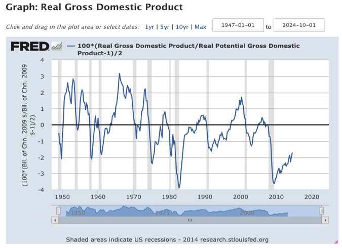
Modify that chart by selecting “Add Data Series” and typing “GDPPOT” into the keywords box. GDPPOT is the keyword for the Congressional Budget Office’s measure of potential GDP. Then select the radar box “Modify existing series – Data Series 1” and click “Add Series.” Under “Edit Data Series 1” select “Create your own data transformation.” In the formula box, type “100*(a/b-1)/2” without the quotation marks and click “Apply.” The modified graph now shows the output gap divided by 2, which is a term in the Taylor Rule.
Modify the graph further by adding the inflation rate, the inflation gap and the long-run real equilibrium rate. Select “Add Data Series” and type “PCEPI” (for the price index of personal consumption expenditures) in the keywords box. Make sure the radar box for “Modify existing series – Data Series 1” is still checked and click “Add Series.” Under Edit Data Series 1, item (c) will be the new price series. In the “Units” dropdown box for item (c), select “Percent Change from Year Ago.” Then, in the formula box, type “2+c+(c-2)/2+100*(a/b-1)/2” without the quotation marks and click “Apply.” The Taylor Rule will now appear.
Change the time period to begin in 1970 by clicking on the start time above the graph and changing it from 1947-01-01 to 1970-01-01. To compare the Taylor Rule to the actual policy rate, click “Add Data Series” again and type “FF” (the data code for the effective federal funds rate) into the keywords box. This time, select the radar box for “Add new series” and click “Add series.” Then, under “Edit Data Series 2” change the Frequency dropdown box from “Weekly, Ending Wednesday” to “Quarterly.”
Your chart now shows both the Taylor Rule and the actual federal funds rate at a quarterly frequency beginning in 1970. While the two time series move together, note that the Taylor Rule was persistently higher than the funds rate in the 1970s. Note also that the Rule was well below zero in 2009, but the funds rate did not sink below the “zero lower bound” for nominal interest rates.
Keep in mind that you don’t need to know any FRED data codes to make charts. FRED helps you search for data as long as you can describe it. Try, for example, typing “real GDP” into the search box at the top right of the FRED page. You’ll get a range of data choices ranked by their frequency of use. The first one in the list – “Real Gross Domestic Product” measured in “Billions of Chained 2009 Dollars, Quarterly. Seasonally Adjusted Annual Rate” – is the GDPC1 indicator that we used above.


